SEO Rules
Engine Specifications
- URL
- Schema.org Structured Data
- HTTP Status Codes
- Mobile Adaptation
- Core Web Vitals
- Hreflang Tags
- Noindex Tags
- JS Loading
SEO Elements
Website Content
Mobile adaptation is crucial for SEO, mainly reflected in aspects such as improving search engine rankings, enhancing user experience, reducing bounce rates, improving accessibility, and increasing conversion rates. Through responsive design, optimizing page loading speed, ensuring content adaptation, optimizing touch experience, and regular testing and monitoring, the mobile friendliness of websites can be significantly improved, thereby enhancing SEO effects. In the mobile internet era, emphasizing mobile adaptation is key to success. The importance of mobile adaptation for SEO is mainly reflected in the following aspects:
1. Improve Search Engine Rankings
Mobile-First Indexing: Google now primarily indexes and ranks based on the mobile version of websites. This means if your website performs poorly on mobile devices, it may affect your ranking in search results.
Algorithm Updates: Algorithms of Google and other search engines prioritize mobile-friendly websites. For example, Google's mobile-friendly update explicitly states that mobile-friendliness is a ranking signal.
2. Improve User Experience
Page Loading Speed: Page loading speed on mobile devices is crucial for user experience. Slower loading speeds increase bounce rates and affect user dwell time on websites, indirectly impacting SEO.
Screen Size Adaptation: Mobile adaptation ensures content adapts to different screen sizes, providing consistent user experience. Good user experience reduces bounce rates, increases user interaction, and subsequently improves SEO effects.
3. Reduce Bounce Rates
Responsive Design: Through responsive design, websites can automatically adjust layouts to accommodate different device screen sizes and resolutions. This helps reduce users leaving the website quickly due to poor content display, thereby reducing bounce rates.
Touch Optimization: Optimizing button and link sizes and positions to make them more touch-friendly helps increase user interaction rates and reduce bounce rates.
4. Enhance Accessibility
Easy Navigation: Mobile adaptation ensures navigation menus and links are easy to use and access on mobile devices. This is crucial for improving user experience on websites.
Text Readability: Adjusting font sizes and spacing makes text easy to read on mobile devices, reducing the likelihood of users leaving due to reading difficulties.
5. Increase Conversion Rates
Convenient Operations: Optimizing forms, shopping carts, and payment processes to make them convenient on mobile devices reduces the possibility of users abandoning operations, increasing conversion rates.
Local Search Optimization: Many users perform local searches through mobile devices, ensuring mobile adaptation can improve local search visibility and conversion rates.
Best Practices for Implementing Mobile Adaptation
1. Use Responsive Design
Automatic Layout Adjustment: Ensure websites can automatically adjust layouts based on different device screen sizes.
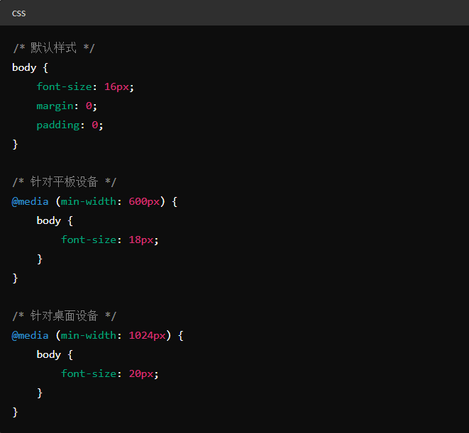
Use Media Queries: Define styles for different screen sizes through CSS media queries.
2. Optimize Page Loading Speed
Image Optimization: Compress images and use appropriate file formats, such as WebP.
Use CDN: Improve content delivery speed through Content Delivery Networks (CDN).
Reduce HTTP Requests: Combine CSS and JavaScript files to reduce HTTP request counts.
3. Ensure Content Adaptation
Elastic Layout: Use elastic layouts to allow page elements to automatically adjust based on screen size.
Readability: Ensure text has good readability on all devices, including font size, line spacing, and contrast.
4. Optimize Touch Experience
Buttons and Links: Ensure buttons and links are appropriately sized for easy touch.
Touch Target Spacing: Increase spacing between touch targets to avoid accidental operations.
5. Testing and Monitoring
Cross-device Testing: Test website performance on different screen sizes and operating systems using simulators and real devices.
Monitoring Tools: Use Google Search Console's mobile-friendly report and PageSpeed Insights tool to regularly monitor and optimize mobile performance.
Code adaptation and automatic redirection adaptation are two common mobile adaptation approaches
Code Adaptation (Responsive Design): By using media queries, flexible layouts, flexible units, and other methods, websites can adapt to different screen sizes and resolutions. This approach is suitable for cases where a consistent experience needs to be provided for different devices under the same URL.
Automatic Redirection Adaptation: By checking user agents, server-side parsing, viewport width checks, and other methods, users are automatically redirected to corresponding mobile or desktop pages. This approach is suitable for cases where different URLs need to be provided for different devices.
The following are their detailed implementation methods:
1. Code Adaptation (Responsive Design)
Implementation methods of responsive design mainly include:
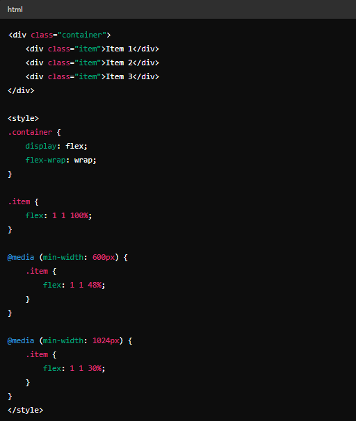
(1) Using Media Queries
Through CSS media queries, different styles can be applied based on different screen sizes and resolutions.
Example:
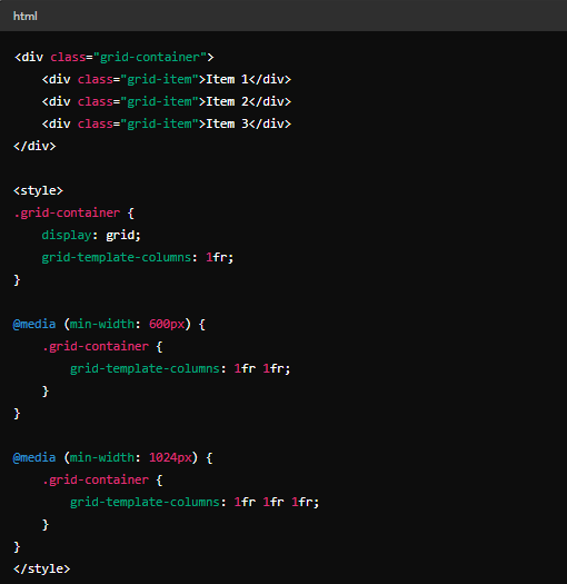
(2) Using Flexible Layout
Using flexible layout (Flexbox) or grid layout (Grid) can easily achieve responsive design.
Flexbox Example:
Grid Example:
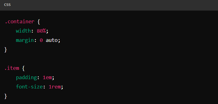
(3) Using Flexible Units
Using relative units such as percentages, em, rem, etc., to make layouts adaptable to different screen sizes.
Example:
2. Automatic Redirection Adaptation
Automatic redirection adaptation refers to automatically redirecting users to corresponding mobile or desktop pages based on their device.
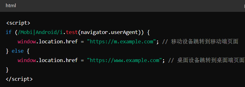
(1) User Agent-Based Redirection
By checking the user agent, determining the device being used by the user, and performing redirection.
Example (using JavaScript):
(2) Server-Side Redirection
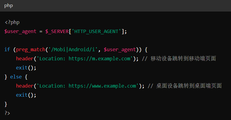
On the server side, redirecting by parsing user agent information in HTTP request headers.
Example (using PHP):
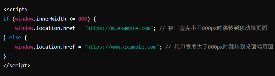
(3) Viewport Width-Based Redirection
Redirecting by checking the device's viewport width.
Example (using JavaScript):
Detailed Specifications:
1. Adaptive Design: Recommended to use adaptive mobile adaptation methods, providing the same HTML code through the same URL, regardless of the device used by the user, but can present content differently based on screen size;
2. Code Adaptation Method: Depends on user-agent sniffing and Vary: user-agent HTTP response headers to provide different versions of HTML for different devices;
3. Redirect Adaptation: Uses separate URLs to provide different HTML for each device, relying on user-agent and Vary HTTP headers to redirect users;
4. When using code adaptation and redirect adaptation, use the same robots meta tags, noindex tags, and structured code on mobile and desktop versions of the website;
5. Redirect adaptation and code adaptation should not rely on user interactions to delay loading main content, ensuring Google can see delayed loaded content;
6. Allow Google to crawl content on both mobile and desktop versions of the website, avoiding different site blocking rules that prevent content from being crawled;
Example:
Mobile:
Desktop:
Reference Website:
Official Google Explanation:
Google primarily uses mobile website content crawled through smartphone agents for indexing and ranking. This is called mobile-first indexing.
While having a mobile version of your webpage is not required to include your content in Google search results, we strongly recommend providing a mobile version. These best practices apply to general mobile websites and are by definition suitable for mobile-first indexing.
To ensure users have the best experience, please follow the best practices detailed in this guide.
1. Create a Mobile-Friendly Website
If you don't yet have a mobile-friendly website, create one first. This way, users accessing your website through mobile phones can have an excellent experience. To create a mobile-friendly website, there are three configuration options:
(1) Responsive Design: Provide the same HTML code through the same URL, regardless of the device used by the user (e.g., desktop, tablet, mobile, non-visual browsers), but can present content differently based on screen size. Google recommends using responsive design as it is the easiest design pattern to implement and maintain.
(2) Dynamic Serving: Use the same URL regardless of the device. This configuration relies on user-agent sniffing and Vary: user-agent HTTP response headers to provide different versions of HTML for different devices.
(3) Separate URLs: Use separate URLs to provide different HTML for each device. Like dynamic serving, this configuration relies on user-agent and Vary HTTP headers to redirect users to the appropriate website version for their device.
The content of this guide applies only to dynamic serving and separate URLs configurations. If using responsive design, the content and metadata of mobile and desktop webpages are the same.
2. Ensure Google Can Access and Render Your Content
Ensure Google can access and render your mobile webpage content and resources.
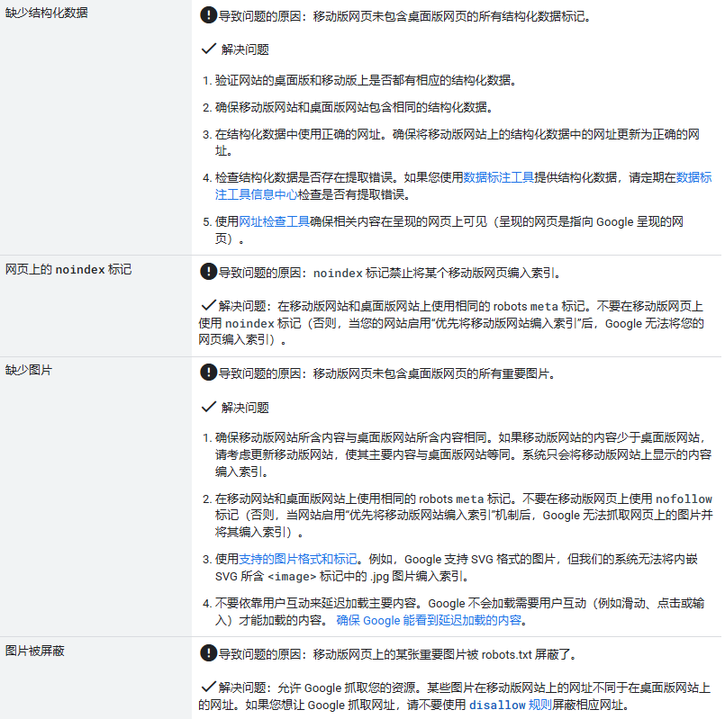
(1) Use the same robots meta tags on mobile and desktop versions of the website. If you use different robots meta tags (especially noindex or nofollow tags) on your mobile version, Google may not be able to crawl and index your webpages after your site enables mobile-first indexing.
(2) Don't rely on user interactions to delay loading main content. Google does not load content that requires user interactions (such as swiping, clicking, or typing) to load. Ensure Google can see delayed loaded content.
(3) Allow Google to crawl your resources. Some resources have different URLs on mobile versions than on desktop versions. If you want Google to crawl your URLs, ensure you are not blocking the corresponding URLs with disallow rules.
3. Ensure Desktop and Mobile Versions Have the Same Content
Even for consistent content, differences in DOM or layout between desktop and mobile webpages may cause Google to have different understandings of the corresponding content. However, having the same content in desktop and mobile versions ensures both versions can rank for the same keywords.
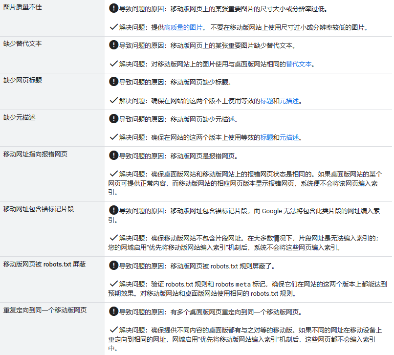
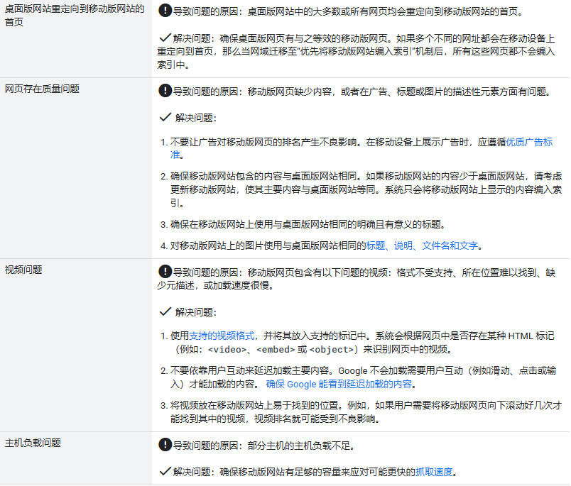
(1) Ensure the mobile version contains the same content as the desktop version. If the mobile version has less content than the desktop version, consider updating the mobile version to make its main content equivalent to the desktop version. You can use different designs for mobile devices to maximize user experience (for example, moving content to accordion-style folding interfaces or tabs); just ensure the content is the same as the desktop version, as almost all indexing of your website comes from the mobile version.
If you originally intended for the mobile version to have less content than the desktop version, you may lose some traffic after your site enables mobile-first indexing, as Google cannot extract as much information from your webpages as before. Consider moving content to accordion-style folding interfaces or tabs to save space instead of removing content.
(2) Use the same clear and meaningful titles on the mobile version as on the desktop version.
4. Check Your Structured Data
If your website has structured data, ensure both versions of the website contain this data. Here are some specific items to check:
(1) Ensure the mobile and desktop versions contain the same structured data. If you need to determine which types of structured data to prioritize adding to the mobile version, start with Breadcrumb, Product, and VideoObject structured data.
(2) Use correct URLs in structured data. Ensure you update URLs in structured data on the mobile version to mobile URLs.
(3) If you use data markup tools, train them on the mobile version. If you use data markup tools to provide structured data, regularly check the data markup tool dashboard for extraction errors.
5. Add the Same Metadata to Both Versions of the Site
Ensure equivalent title elements and meta descriptions are used on both versions of the site.
6. Check Ad Placement
Don't let ads have adverse effects on mobile webpage rankings. When displaying ads on mobile devices, follow quality ad standards. For example, ads at the top of webpages occupy too much space on mobile devices, creating a poor user experience.
7. Check Visual Content
(1) Check Images
Ensure images on the mobile version follow image best practices. Specifically, we recommend:
①Provide high-quality images. Don't use images that are too small or have low resolution on the mobile version.
②Use supported image formats. Don't use unsupported formats or markup. For example, Google supports SVG format images, but our system cannot index .jpg images in embedded SVG <image> tags.
③Don't use image URLs that change every time the webpage loads. If your resources use constantly changing URLs, Google will not be able to process these resources and index them.
④Ensure alternative text for images used on the mobile version is the same as on the desktop version. Use the same descriptive alternative text for images on the mobile version as on the desktop version.
⑤Ensure content quality on mobile webpages is as good as on desktop webpages. Use the same titles, captions, filenames, and text for images on the mobile version as on the desktop version.
If the desktop and mobile versions of your website use different image URLs, you may experience temporary image traffic loss when the site switches to mobile-first indexing. This is because: for Google's indexing system, images on the mobile version are new content, and new image URLs need time to accumulate sufficient historical search results to improve rankings. To prevent temporary image traffic loss, use the same image URLs on both versions of the site. If you don't mind temporary image traffic loss, no action is needed.
(2) Check Videos
Ensure videos on the mobile version follow video best practices. Specifically, we recommend:
①Don't use video URLs that change every time the webpage loads. If your resources use constantly changing URLs, Google will not be able to process these resources and index them.
②Use supported video formats and place videos in supported markup. Videos on webpages are identified based on the presence of certain HTML tags (e.g., <video>, <embed>, or <object>) in the webpage.
③Use the same video structured data on mobile and desktop versions. For details, see check structured data.
④Place videos in easily accessible locations when viewing webpages on mobile devices. For example, if users need to scroll down multiple times on the mobile version to find the video, video rankings may be adversely affected.
8. Additional Best Practices for Separate URLs
If your website uses separate URLs (also known as m. URLs) for desktop and mobile versions of a webpage, we recommend following some additional best practices as follows:
(1) Ensure error page status is the same on both desktop and mobile versions of the website. If a webpage on the desktop version provides normal content while the corresponding mobile version shows an error page, the webpage will not be indexed.
(2) Ensure the mobile version doesn't contain fragment URLs. The fragment portion of a URL is the part at the end of the URL that starts with #. In most cases, fragment URLs are not indexable; when a domain enables mobile-first indexing, these pages will not be indexed.
(3) Ensure each desktop version with different content has a corresponding equivalent mobile version. If after your domain enables mobile-first indexing, multiple different URLs redirect to the same URL (for example, redirecting to the home page on mobile devices), none of these webpages will be indexed.
(4) Verify both versions of the website in Search Console to ensure you can access data and messages from both versions. When Google switches your website to mobile-first indexing, your website may experience data changes.
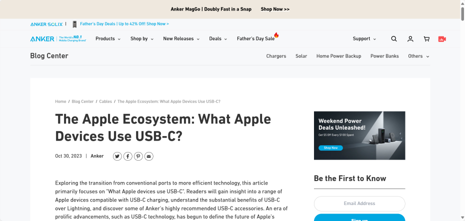
(5) Check hreflang links in separate URLs. When you use rel=hreflang link elements to internationalize your website, link separately to mobile and desktop URLs. Mobile version hreflang must point to mobile URLs, and similarly, desktop version hreflang must point to desktop URLs.
The following is a homepage hreflang example for a website using separate URLs for mobile and desktop versions.
(6) Ensure the mobile version has sufficient capacity to handle potentially faster crawling speeds.
(7) Verify robots.txt rules to ensure they work as expected on both versions of the website. You can specify which parts of your website are crawlable and which parts are not through the robots.txt file. In most cases, you should use the same robots.txt rules for mobile and desktop versions.
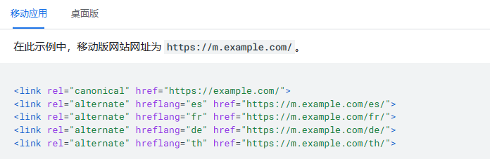
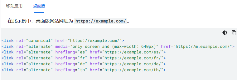
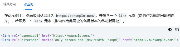
(8) Use correct rel=canonical and rel=alternate link elements between mobile and desktop versions. Desktop URLs are always canonical URLs, while mobile URLs are alternate URLs for that URL.
The following are examples of rel=canonical and rel=alternate for websites using separate URLs.
9. Troubleshooting
The following lists various common errors that may prevent your website from enabling mobile-first indexing, or may cause ranking drops after enabling mobile-first indexing. If your website has not yet enabled mobile-first indexing, you notice ranking drops after enabling mobile-first indexing, or you receive related messages in Search Console, please check the common error list and resolve any potential errors: